Blog Post
Digital Marketing Blog
5 Free Tools To Create A Website Color Palette
- By James QUINN
- •
- 19 Mar, 2016
- •
We live in a world full of color, choose wisely
"Use every crayon color that you've got", so says the lyrics to Eric Church's
song - Three Year Old. While that may be a wonderful song from a dad to his son, you shouldn't use every color on your website, your social media posts, flyers, business cards, or anything else that you need to make a first, lasting impression to a potential customer. Except most people, including myself, didn't go to an art school. So how do you carefully decide what colors to use when creating a stunning website color palette? Here's a few free color tools that I use regularly and highly recommend.
1) Color Meter - Mac OS X
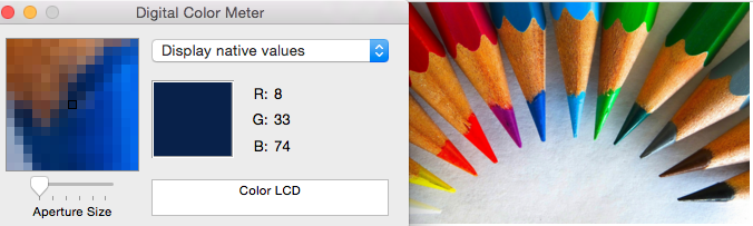
This first free color tool is part of the Mac OS X system. It's most basic use is to get an RGB value for anything you put the cursor on. It's built in to OS X, but it's not highlighted anywhere. It's likely not in your dock already, so let's add it. Hit CMD-SPACE to search for "Color Meter", or go to your applications folder and look for color meter. Although with OSX 10.10 Yosemite, Apple changed the name to Digital Color Meter, same program.
Once you have it open, it will start to instantly give you RGB values wherever the pointer is. Just hover over an image or an existing background, or anything and it will give you the value. For instance, in the screen shot above you can see the mouse is hovering over one of the blue pencils giving it a value of R:8, G:33, B:74. You can then use that in various other programs to match the color. Use it to select a base color that you are looking for.
A little tip on this: You may need to lock the where it's pointing. If you get the RGB value and then switch to another program, it will change the values because now your mouse isn't on that same window area and you just lost the code. To prevent this from happening, his CMD-X and CMD-Y to lock the x and y axis respectively.
2) Instant Eyedropper Tool - Windows
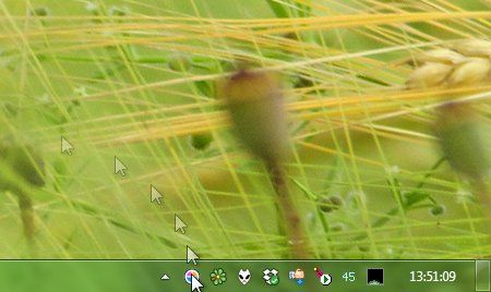
If there's a built in tool that Microsoft provides for Windows users, I'm not aware of it. There is a free add on you can get from Instant Eyedropper Tool
though. It works similar to the Color Meter. It has an advantage though. Instead of just hovering over and giving you the RGB value, a 'click' on the pixel area will copy the HTML code of the color to the clipboard, allowing you to paste it into your website (if needed).
Easy instructions from their website are:
1) Move the mouse pointer to the Instant Eyedropper icon in the system tray.
2) Press and hold the left mouse button and move the mouse pointer to the pixel whose color you want to identify.
3) Release the mouse button.
That's it!
Easy instructions from their website are:
1) Move the mouse pointer to the Instant Eyedropper icon in the system tray.
2) Press and hold the left mouse button and move the mouse pointer to the pixel whose color you want to identify.
3) Release the mouse button.
That's it!
3) Adobe Color Wheel
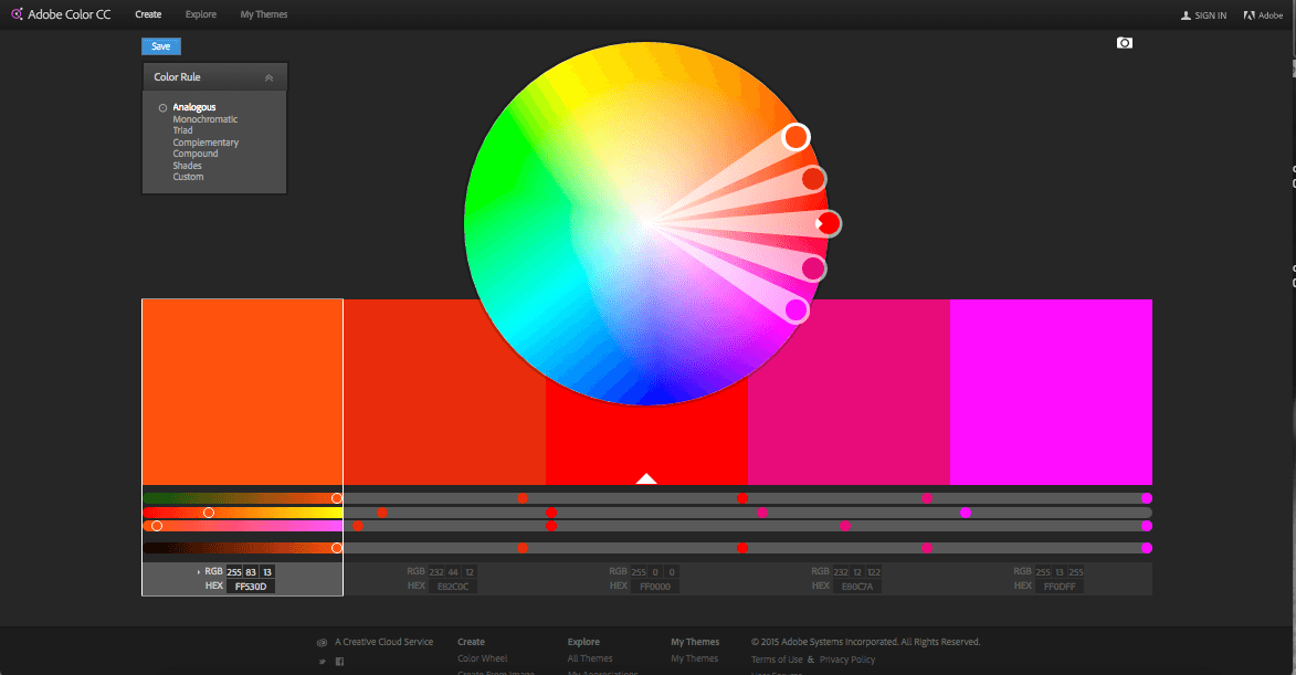
Adobe Color Wheel
has become my go to resource for creating palettes. You don't even need to login to use this. Though if you do sign in and have a CC membership, you can transfer the swatches over to an applicable CC program. It lets you create 7 different types of palettes: Analogous, Monochromatic, Triad, Complimentary, Compound, Shades and Custom.
All you need to do is put one color in and it will create the rest for you. So for instance, you can use one of the color pickers from above, and then take the color code and pop it into the color wheel's middle area and it will return the corresponding 4 other colors depending on the mode you choose. From there you can take the other codes and copy-paste them where ever you need them. Below is a short explanation of four different types of palettes created.
Analogous - These are groups of colors next to each other on the color wheel. For instance, you might have: Red, Orange and then Red-Orange.
Monochromatic colors - These are the colors (shades) of a single HUE. Best way to visualize this is a paint swatch in your local paint store. You can see the colors going from darker to lighter but all in the same color family.
Triadic Color - A triadic color palette uses colors that are evenly spaced around the color wheel. Think of a color, then create an equilateral triangle in your head and the other two points make up a triadic color palette.
Complimentary Colors - These are colors directly opposite each other in the color wheel, such as red and green or blue.
Which one should you use? Well, whatever one you like best. I recommend sticking to no more than THREE colors for any given project, but particularly on web. I usually use a monochromatic palette as it easiest on the eyes and I choose two colors from it and then take a third color thats very contrasting to use when I need to make something 'pop'.
4) Paletton - Color Scheme Designer
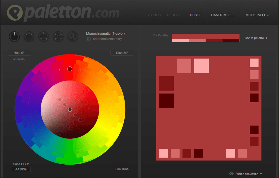
Up until I discovered Adobe Color Wheel, I was using Paletton
very frequently. Paletton has several features over Adobe. One of those is the ability to export the palette without signing in. You can export the color list as HTML, CSS, XML or Text. You can further save the swatch as a PNG file which you can then drop into a photo editor and use the color picker to create graphics and text.
They also offer a neat way to show a quick mockup of what the color scheme looks like with the Examples tab. It will show you a basic website with a bunch of Lorem Ipsum's everywhere, but using the color palette. You can even change the theme from a white background, to a dark or negative space.
There are other examples to choose from such as artwork and also animations. The artwork lets you choose from a shatter explosion, flowers, splash, glitter or fabric.
There are two animations you can choose from, Bubbles or Stripes.
The board on the right has the colors repeating themselves but in larger or smaller blocks so you can have an idea of how they'll relate to each other at different sizes.
5) Colour Lovers
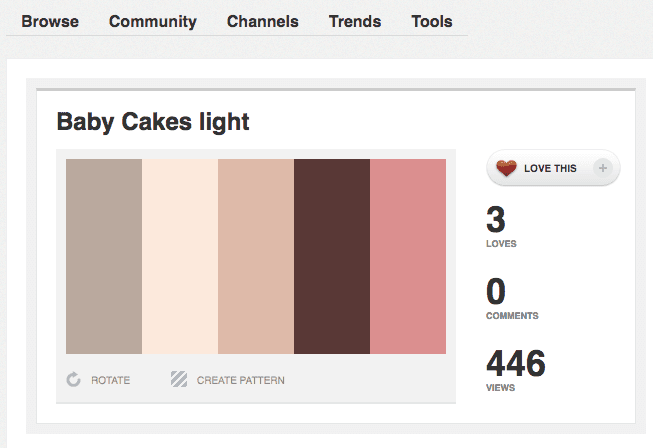
Colour Lovers
is a creative community where people from around the world create and share colors, palettes and patterns. I only recently discovered this but am already loving it. I recently started working on a mockup for a local bakery. I knew in my head what colors I wanted, but I couldn't find the exact color combinations. I searched for a bakery palette in Colour Lovers and was able to find the above palette shown in the screenshot. It was exactly what I was looking for. Although, there were actually several variations of this palette, this is the one I was looking for.
Colour Lovers allows you to see the individual HEX or RGB values for each swatch, or you can save the palette as an image. The export options are very simple, but very powerful. If you need a bit of inspiration, try out Colour Lovers. If it's not exactly what you're looking for, try taking one color that you want as a base and pop it into Adobe's Color Wheel or Paletton.com and see what new results you can get back.
Colour Lovers allows you to see the individual HEX or RGB values for each swatch, or you can save the palette as an image. The export options are very simple, but very powerful. If you need a bit of inspiration, try out Colour Lovers. If it's not exactly what you're looking for, try taking one color that you want as a base and pop it into Adobe's Color Wheel or Paletton.com and see what new results you can get back.
Are there other tools that you are aware of? What are your favorites? Let us hear it in the comments.

There are no less than 35+ companies that fall under the umbrella of Marketing Automation. Not including the amount of CRM’s (Customer Relationship Manager) and ESP’s (Email Service Providers) that are out there.
There are no less than 35+ companies that fall under the umbrella of Marketing Automation. Not including the amount of CRM’s (Customer Relationship Manager) and ESP’s (Email Service Providers) that are out there. When considering the technology differences between MA, a CRM and an ESP, many of the features are overlapping. However, only Marketing Automation offers what a CRM can do, what an ESP can do & much more.

Do you know that the number one visited page on a restaurant website is, besides their homepage?
The restaurant menu.
Chances are, if you recently visited a restaurant's website, you were probably looking for their menu to whet your appetite. It's possible that you might also go their to see any specials or events going on, but primarily you want to see what's cooking.
If you own a restaurant, you're in the business of guest service.
Google is in the business of getting the right information to the right person at the right time.

If you’re working with some budget constraints, and you’re working with a professional designer – choosing to start with a template can be a great way to get your website up and running. If you’re on time constraints, templated websites work great for that as well. However, if you're looking for a professional, one of a kind user experience, then custom is the way to go.

If you’re like me, then you my friend, are a data junkie. Even if you’re not a data junkie, you can still appreciate measuring your ROI. What I’m saying here, is that while the world is going (has gone) digital, you can still make excellent use of offline marketing campaigns and advertising.
We are a visual society, so you should be using at least one of these options on your website.Just like website design ranges from no use of images to the overuse of them, same is true with icons today. More than ever, some webpages are being cluttered with icons, that often add no context to the page or just add nothing to the user experience.When is it good to use an icon on your website? Here's a few criteria I follow plus some resources for putting icons on your website.

What’s more important to you: A shiny trophy for being number one on Google or a boat load of new clients coming your way. Yes, we have said before that the number one position on Google gets 33% of the traffic for that keyword, but what do you see coming up as number one now-a-days? Local Directories come up first. Do a quick Google search for anything local business related, and the first page of results will be review sites and directories.