Blog Post
Digital Marketing Blog
Why I Design Using Four Screens
- By James QUINN
- •
- 07 Mar, 2017
- •
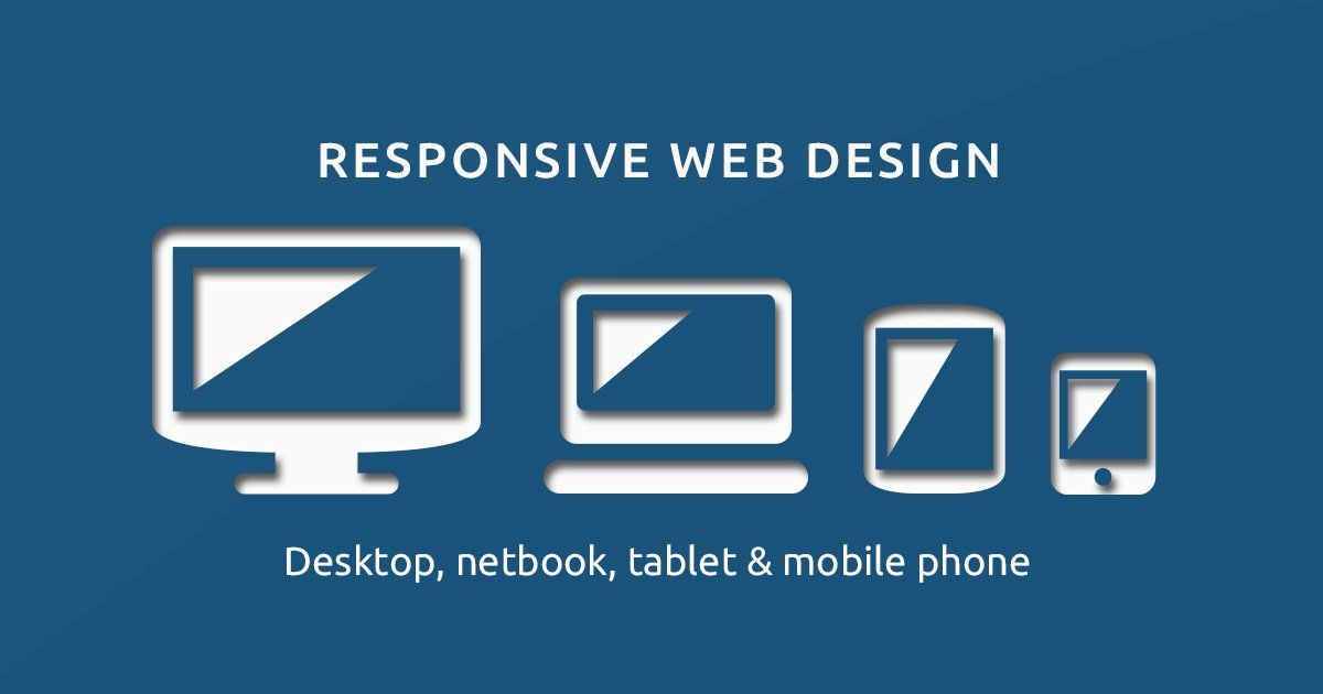
In 2017, your web designer should be using at least four screens to design in
Did you know that the average consumer checks your website at least two times from two different devices before they journey into your location? Over 60% of searches
start from a smartphone device, but there is still a great amount of desktop and tablet traffic coming in. Why is that? Some of that desktop traffic is the original, organic traffic yes. However, a lot of it is a returning customer. Perhaps you're a kitchen remodeler, someone searches for "kitchen remodeling" and they find your website from their smartphone. They're not ready to buy yet though. So they bookmark or they email their significant other the web address. When they get home, they venture to their desktop or start using their tablet to continue the research.
Most (amateur) web designers only pay attention to the desktop view. Sad face: many web designers still build websites that are desktop only, they're not building responsive websites
that are mobile-optimized. The worst part is they're often designing this on a 20" or larger monitor. Of course it's easy to design a great site when you have 20" of a digital canvas to work with. The real Picasso comes out when you can take that same great experience and display that on a 4" screen, AND to optimize it for as slow as a 3G connection. There's a big difference between your site being mobile-friendly and mobile-optimized. Mobile-friendly usually just means making sure the content is formatted to scroll up and down and no content stretches beyond the width of the smartphone screen. Mobile-optimized is taking the same content from your desktop and optimizing it for a mobile experience. This is important now more than ever, as Google has started to ONLY SEO Index your mobile site
and not your desktop site.
So that's the why I design websites using four screens. You might interested in knowing what are the screens I design with, and how I use each one of them to turn your website from blah to Yahhh! I only build websites that are responsive. I check how the content looks and how the content interacts along the way. Below are the screens that I use to check this with and more importantly, the order in which I do this.
Screen #1 - Smartphone
You might be shocked to think that the first screen I check my work on is a mobile device. If you were a bakery and 60% of your revenue came from donuts, would you start your morning by prepping the cookies and pastries? You start with your money maker! Well, since over 60% of all Google searches start
from a mobile device, why would you start with the device that people aren't using as much? I'll tell you why, it's because you're working with an amateur designer. Or perhaps you're working with a legacy designer who won't budge. When I design in a mobile-first environment, I can truly focus on that experience and maximizing it's potential. We focus on getting the most important information right away. For most businesses this means placing a "TAP-TO-CALL" style button at the top of the page. Nothing is more frustrating than having to remember the number in your head and quickly double-tap-your-home-button to get to the phone dialer and attempt to get every number in there correctly. If location visits are important we also make sure there are easy-to-find buttons for loading your bulit-in GPS navigation.
What do you think the next screen is going to be?
Screen #2 - Tablet
Did you guess that correctly? It's only natural to work my way up the screen size. Now that I've mastered the experience for mobile, I can open up canvas a little here and work on the tablet view. Tablets today range from about 7"-10" and yes there are those two outliers that are around 13", but they're still a tablet, at least according to the internet browser being used. A growing trend for the tablet view is using what we call the "hamburger" menu. That's the 3-line menu button you might see in the upper right or left hand corner of the screen. We layout the navigation in both the hamburger format and the traditional horizontal navigation. It all depends on the business and the goal of your website. That's why we custom design all of our sites starting with a 1-on-1 consultation. Since a tablet is still inherently a mobile device where the user interacts using only a touchscreen, we still are focusing on easy, tappable buttons. Consumers are used to tapping on items with their tablets, we make it super easy for that to happen. Gone are the days of only making links available from within the text. Consumers need clear call-to-action buttons to guide them along their buying journey.
Screens #3 & #4 - Laptop & Large Monitor
Technically I'm designing and coding everything on my large monitor, but the testing is being done on multiple screens. However, when I start to design for the desktop, I'm using my laptop which dual outputs to a 21" cinema display. This allows me to have the freedom of design but to see how it will interact on a 13" monitor (which is about the average monitor size for a small laptop). The most important content is "above the fold". So if it's not designed right, some of the content that looks good on 21" would normally get cut off on a smaller screen. We make sure that doesn't happen. The desktop design is where it does get a lot more fun, and more roomy. It's like trying to pack a bunch of moving boxes into a cargo van when you've been using your 1988 Corolla earlier that day. Ahh, you can breathe a little. However, use this space carefully. Remember, with great space comes great responsibility. I've seen many web designers who came from a graphic design background. It is honestly a natural progression, but it's an entirely different approach. Use a white space or negative space is critical here. So if you're used to working with that graphic designer who loves using tons of colors and turning text into metal like beveled art and everything else that came with cheap Photoshop work from 10 years ago, they're in the wrong arena. You have about 5 seconds to capture someone's attention before they'll decide to leave the website. Now, a lot of that comes from excellent copywriting and headline writing, but bad design choices will confuse the consumer and cause them to leave and go to the next result in line.
So there you have it. The method to my madness. Some people look at website design and say why not, I look at website design and say why? Rule of thumb: Just because you can do something, doesn't mean you should. I'm on the web all day long. I can easily spot a badly performing website, in terms of conversion. Today, you're website is all about conversion. Your business can't afford to run a wiki-pedia website. It needs to be a lean, mean, lead-generating machine. This applies to all business websites.
What are some examples of good and bad website design that you have seen?

There are no less than 35+ companies that fall under the umbrella of Marketing Automation. Not including the amount of CRM’s (Customer Relationship Manager) and ESP’s (Email Service Providers) that are out there.
There are no less than 35+ companies that fall under the umbrella of Marketing Automation. Not including the amount of CRM’s (Customer Relationship Manager) and ESP’s (Email Service Providers) that are out there. When considering the technology differences between MA, a CRM and an ESP, many of the features are overlapping. However, only Marketing Automation offers what a CRM can do, what an ESP can do & much more.

Do you know that the number one visited page on a restaurant website is, besides their homepage?
The restaurant menu.
Chances are, if you recently visited a restaurant's website, you were probably looking for their menu to whet your appetite. It's possible that you might also go their to see any specials or events going on, but primarily you want to see what's cooking.
If you own a restaurant, you're in the business of guest service.
Google is in the business of getting the right information to the right person at the right time.
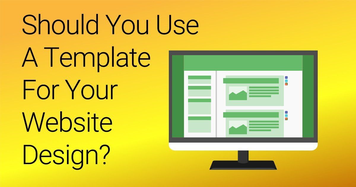
If you’re working with some budget constraints, and you’re working with a professional designer – choosing to start with a template can be a great way to get your website up and running. If you’re on time constraints, templated websites work great for that as well. However, if you're looking for a professional, one of a kind user experience, then custom is the way to go.

If you’re like me, then you my friend, are a data junkie. Even if you’re not a data junkie, you can still appreciate measuring your ROI. What I’m saying here, is that while the world is going (has gone) digital, you can still make excellent use of offline marketing campaigns and advertising.
We are a visual society, so you should be using at least one of these options on your website.Just like website design ranges from no use of images to the overuse of them, same is true with icons today. More than ever, some webpages are being cluttered with icons, that often add no context to the page or just add nothing to the user experience.When is it good to use an icon on your website? Here's a few criteria I follow plus some resources for putting icons on your website.

What’s more important to you: A shiny trophy for being number one on Google or a boat load of new clients coming your way. Yes, we have said before that the number one position on Google gets 33% of the traffic for that keyword, but what do you see coming up as number one now-a-days? Local Directories come up first. Do a quick Google search for anything local business related, and the first page of results will be review sites and directories.