Digital Marketing Blog
4 Types of Website Design
- By James QUINN
- •
- 15 Dec, 2015
- •
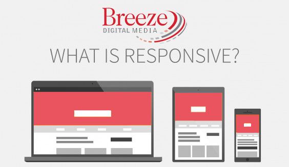
What is Responsive Design anyway?
What do you mean four types? The wide world of websites can be quite confusing. It changes rapidly and understanding all of the terms can be challenging. SEO what? Mobile-Friendly huh? Responsive what-sie? So I'm going to take a few minutes and explain the differences to outline exactly what each of the types of websites are, which type we build with, and why you should choose one or the other.
Let's shamelessly begin with our product.
Our main websites use the responsive design concept. This is a fancy smanshy way of saying the website automatically adjusts to the screen size its being viewed on. There are many different ways to build a multi-screen website. Let's cover a few of them
One - Adaptive Design
Adaptive websites will deliver at least two different websites depending on the device type. This means the mobile site is completely separate from the desktop. This is where you would see a M.example.com from your smartphone verses a www.example.com on your desktop.
This has the ability to display content that is specific for those devices and nothing unnecessary for one or the other. This is the technology we would use to build you a mobile-friendly companion to your legacy desktop site.
Nothing beats the customization of having different websites for each device, but maintaining two sites can be a challenge. Note: we get around this problem by linking the two sites together with a bit of genius on our part.
Two - Responsive
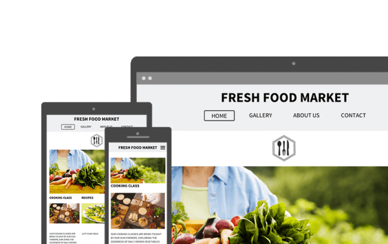
Responsive design is method of building websites so that the content rearranges itself based on the screen size, verses device type. You can tell if a site is responsve simply by changing the size of your browser window on your desktop. If the content rearranges when you make tiny like a smartphone, then the site is responsive.
So far we have covered two types of websites and here's the easy way of identifying:
Adaptive: 2 websites > by device type > changes content
Responsive: 1 website > by screen size > doesn't change content
Now on to my favorite...
Responsive sites load up all of the code and content for viewing the website every single time, regardless of the device its being viewed on. Sometimes this leads to a slow load time, especially on older smartphones or poor cell phone data coverage.
Enter the world of Responsive plus server-side support.
Three - Responsive plus server-side support (RESS)
Responsive plus server-side support is also called RESS or dynamic serving. This is the type of responsive we build all of our main multi-screen sites with. This means the website will first check which type of device it's being viewed on before the site is loaded, then displays content that's tailored for that device and responds to the screen size.
So thinking about the Adaptive and Responsive website, Dynamic Serving Responsive websites looks like this:
RESS: 1 website > by device type > changes content
For example, an RESS website could detect a user is on smartphone then display a responsive website with content made just for smartphones, while adjusting content made for desktops or tablets. Since the website is responsive, it will adjust the content based on the screen size. So it will appear beautifully wether it's an older 3.5" smartphone or a newer (obnoxious) 6" smartphone, and it will adjust if its in portrait or landscape mode. Now that's a lot of work going on behind the scenes!
RESS can be much faster than traditional responsive, as they detect the device and load only the necessary website files for that device. This translates to less website code to download, optimized images, leading to a faster load time and a happier user experience.
RESS also has all of the benefits of traditional responsive design, using a single URL for all devices and a site that responds and looks great on any device. (I wonder how we'll start developing websites to respond on smart watches. *cringe*)
Here at Breeze Digital Media, RESS is the way to go.
What's the fourth type of website?
Four - Legacy Desktop
If you have a website that's desktop only, Shame on you. Ok we actually can't shame you, but really there's an urgent need to update your website. Wether you want to use an adaptive approach where we can create a mobile-only companion to your desktop site, or a complete site redesign using a Responsive site with Dynamic serving, it needs to be addressed.
Smartphones were not designed to view desktop-only websites. Also, google hates websites that are not mobile. In fact, there new policy, termed "Mobile-Geddon" gives preference to mobile-friendly websites. More than 60% of all searches start from a smartphone these days. Google (and yahoo/bing) have said that they will give websites with mobile-friendly versions the higher rankings.
If you don't care about website rankings, I know you care about the customer experience. It's frustrating navigating around a desktop-only site on a smartphone. I'm using an iPhone 6s Plus, and even with its large display, its still difficult to tap on a link, or click a phone number link without hitting the wrong one. The other option is to pinch and zoom my way around, which is just irritating.
Moral of the story? Give the customer what they want, a Responsive Website Experience!
Contact Us today and we'll deliver a free custom mockup of your current website in 72 hours.


