Blog Post
Digital Marketing Blog
How Google's Mobile-First Indexing Will KILL Your SEO
- By James QUINN
- •
- 28 Dec, 2016
- •
Your Desktop SEO Just Isn't Going To Cut It Anymore
Quick Question: What's the first thing you did this morning when you woke up. I'm willing to bet it involved picking up your smartphone and performing some sort of mobile action, wether it's checking email or scrolling through Facebook or Instagram. We are in a mobile-first world. If you're still trying to figure out how to get ahead in this "digital world", this article is well beyond that. The world is (rapidly) shifting to a mobile world. You need to provide an incredible experience on a 4" display as you would on a large display. That's the trick and the problem SMB's have faced. You're not paying attention to your mobile experience.
You might be immediately saying: "Well my website is already mobile." Great, you're (slightly) ahead of the game. It is very likely though, that your website only uses a "mobile site" and not a responsive website design. Mobile-sites are simply optimized for viewing on a phone, they're not optimized for the user experience. Starting pretty soon, you're website's traffic will get killed for it. Listen up.
You might be immediately saying: "Well my website is already mobile." Great, you're (slightly) ahead of the game. It is very likely though, that your website only uses a "mobile site" and not a responsive website design. Mobile-sites are simply optimized for viewing on a phone, they're not optimized for the user experience. Starting pretty soon, you're website's traffic will get killed for it. Listen up.
What is a mobile-first index?
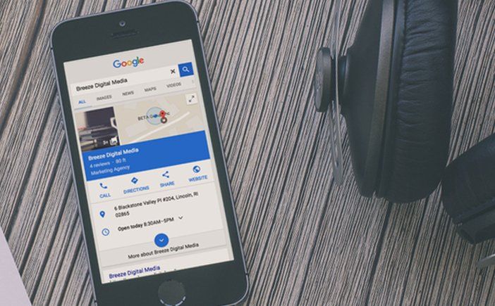
This is the official article on Google's mobile-first index, but this post will provide a recap of what you need to know. First of all, back in April of 2015, Google rolled out what many have called "Mobilegeddon" - It was (and still is) a change to their search algorithm. Basically it looks like this: If a person is searching from
a mobile device and your website is not mobile friendly (or responsive) then Google will display the results of the websites that are
mobile friendly, first. It's all about the first page since that's where 95% of the traffic goes. However, when it comes to content, so far Google has only looked at the content in the website as a whole and just the "desktop" view. Why is this a problem?
Well, post-mobilegeddon, many SMB's turned to creating a 'mobile site', which is essentially a secondary website connected to your main website. It looked something like this in the browser: m.yourcompany.com or mobile.yourcompany.com or possibly yourcompany.com/phone - This is a big problem regardless of search as it requires two different updates for the same website. That's why at Breeze Digital Media, we only design responsive websites. One website for all screens.
When you have two different websites, one for mobile and one for desktop, most of the time you are providing a very different content experience for the mobile user. I actually visited a mobile site for an alarm company once and I received a pop-up saying "Please visit our desktop site. It has so much more to offer." - That really happened. Man, they are going to get crushed when this mobile-first index rolls out. What Google's basically saying is this: "People are using mobile to search more than desktop, so we want to send people to websites that have an incredible user experience on mobile."
How will the mobile-first index work?
This is how indexing in general works: Google has these robots or spiders that crawl through your site looking at the content and structure. One area it looks for is internal links to other content, essentially how easy is it for users to navigate around your website and what are the important pages you are linking to. Mobile-only sites often have a different home page than the desktop and might omit certain links and content from appearing on mobile. So, if Google is now crawling the mobile view of your website, it won't see any of those links or any of the content if it's different than your desktop view. Again, this is where responsive website design
comes into play. One website, same content just optimized for every screen.
Another hit you might end up taking is how slowly your mobile site loads. Google's Page-Speed Insights actually clocks both your desktop and mobile site speeds. There's several ways to make both of them load faster but probably the biggest factor is images. You want to optimize images for mobile vs. desktop. Not everyone is using a super fast LTE/4G connection or connected to Wi-Fi. When designing a site, we use a CDN (Content Delivery Network) to optimize all of the images on the site. We create up to 5 versions of every image so it can be delivered to right device at the right time at the best speed possible.
Another hit you might end up taking is how slowly your mobile site loads. Google's Page-Speed Insights actually clocks both your desktop and mobile site speeds. There's several ways to make both of them load faster but probably the biggest factor is images. You want to optimize images for mobile vs. desktop. Not everyone is using a super fast LTE/4G connection or connected to Wi-Fi. When designing a site, we use a CDN (Content Delivery Network) to optimize all of the images on the site. We create up to 5 versions of every image so it can be delivered to right device at the right time at the best speed possible.
How can I prepare my website for this new rollout?
If you fail to plan, then plan to fail. The first thing you need to do is get an audit of your website. You can get one for free using the link below. We'll scan for SEO errors, marketing mistakes and suggested content improvements and as a bonus your online visibility score. The second thing you can do is get a user-experience testing specific for mobile. User-experience testing takes a real, random user as they go through your website for the first time, describing their thoughts and frustrations. Thirdly, you need to take serious action. If your website is not loading quickly, has content missing from it's desktop countertop or is a fumble waiting to happen while navigating, you really need to rethink your position online. Mobile-first indexing is a real thing. IMHO it's actually worse than the original mobilegeddon rollout in April of 2015. It's assumed by now that you have a mobile website by consumers. However, it's now expected that the mobile experience be just as good as their desktop experience, since people are consuming content from mobile the majority of the time now.


There are no less than 35+ companies that fall under the umbrella of Marketing Automation. Not including the amount of CRM’s (Customer Relationship Manager) and ESP’s (Email Service Providers) that are out there.
There are no less than 35+ companies that fall under the umbrella of Marketing Automation. Not including the amount of CRM’s (Customer Relationship Manager) and ESP’s (Email Service Providers) that are out there. When considering the technology differences between MA, a CRM and an ESP, many of the features are overlapping. However, only Marketing Automation offers what a CRM can do, what an ESP can do & much more.

Do you know that the number one visited page on a restaurant website is, besides their homepage?
The restaurant menu.
Chances are, if you recently visited a restaurant's website, you were probably looking for their menu to whet your appetite. It's possible that you might also go their to see any specials or events going on, but primarily you want to see what's cooking.
If you own a restaurant, you're in the business of guest service.
Google is in the business of getting the right information to the right person at the right time.

If you’re working with some budget constraints, and you’re working with a professional designer – choosing to start with a template can be a great way to get your website up and running. If you’re on time constraints, templated websites work great for that as well. However, if you're looking for a professional, one of a kind user experience, then custom is the way to go.

If you’re like me, then you my friend, are a data junkie. Even if you’re not a data junkie, you can still appreciate measuring your ROI. What I’m saying here, is that while the world is going (has gone) digital, you can still make excellent use of offline marketing campaigns and advertising.
We are a visual society, so you should be using at least one of these options on your website.Just like website design ranges from no use of images to the overuse of them, same is true with icons today. More than ever, some webpages are being cluttered with icons, that often add no context to the page or just add nothing to the user experience.When is it good to use an icon on your website? Here's a few criteria I follow plus some resources for putting icons on your website.
What’s more important to you: A shiny trophy for being number one on Google or a boat load of new clients coming your way. Yes, we have said before that the number one position on Google gets 33% of the traffic for that keyword, but what do you see coming up as number one now-a-days? Local Directories come up first. Do a quick Google search for anything local business related, and the first page of results will be review sites and directories.