Blog Post
Digital Marketing Blog
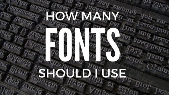
What Fonts Should I Use On My Website
- By James QUINN
- •
- 25 Oct, 2016
- •
Tips on choosing fonts for your website
Your love for comic sans is killing your website. Or the fact that you’re probably using way too many fonts. For a webpage’s sake, using a wide range of fonts (or again use of comic sans or the like) can actually hurt your website’s ranking and more importantly the user experience. Even if you have that font installed on your computer, another user might not have that on his computer, mobile device, screen reader etc. So it’s important to choose the right font. But how do you go about choosing fonts for visitors that you cannot predict what their installed fonts are? Well you can actually predict, sort of.
For starts, there are several fonts that are installed on just about every computer, like Arial, Times New Roman and Comic Sans. Please don’t use Comic Sans, we’re not in third grade anymore (Unless of course you are designing a website for a third-grade class, then go ahead). When a visitor does not have the font installed on their system and they visit your website, their device will download the font so to speak. It won’t be installed on their computer, but the web browser will install it for use. No big deal right? Everyone has a super fast connection these days. Well yes and no. Having one font can actually yield about 5-6 different font files.
Let’s take the most popular font on the web being used, Open Sans. There’s actually 10 versions of that font including: Light, Light Italic, Regular, Regular Italic, Semi-Bold, Semi-Bold Italic, Bold, Bold-Italic, Extra-Bold, Extra-Bold-Italic.
So if you were to use: Regular, Regular Italic, and then also want to have a sentence in bold and italic, and another in just bold, you would have five versions of that one font right there. That still isn’t too bad considering Open Sans is a very light-weight font to begin with, file-size I mean. Here’s the problem, a lot of people use a lot more than one font.
Wether you are a business owner building your website DIY style, or you’re just a BAD web designer, using too many fonts slows your website speed down, which negatively impacts your google search ranking, and again, more importantly the user experience. It’s actually very distracting to have too many fonts used on any page. If you’re using Open Sans lets say for big headings, then Raleway for sub-headings, and then Oswald for paragraphs, you might have anywhere from 15-25 different fonts installed for your website. That’s a heavy load, especially when on mobile. Mobile devices will have a tough time downloading those fonts with a slow network connection. This might cause your visitor to bounce, since statistically 61% of people will abandon a mobile site if it takes more than 3 seconds to load. THREE seconds.
So to answer the original question, what fonts should I use on my website? We can’t exactly give you a specific list of fonts to use, but here’s some general guidelines that will help you.
#1 - Check out Google fonts - popular choices
Google recently changed up their font directory and launched fonts.google.com. Head over there and check out their “popular” fonts. Google’s API is the most frequently used font directory, so using ANY of the 800+ fonts in that directory will give you a good shot at having a compatible font, plus they’re FREE.
#2 - Use the same font as your logo
If you had someone design the logo for you, they might have use a font (verses hand lettering the logo). If they did use a font, ask the designer what font they used and it might be available on Google. If it was a licensed font, you can actually obtain a web-license for most fonts. They might range anywhere from $50-100 and up, but it’s a one-time cost and it GREATLY adds to your branding. There’s nothing like maintaining a consistent brand identity than using a common set of typefaces. (By the way, contact us if you DO need a logo designed)
#3 - Use two fonts, three maximum
I recommend sticking with two fonts, and setting your website to use only the weights you want to use. It doesn’t make sense to download 10 different weights if you’re only going to use Regular and Regular-Italic. Sticking with two fonts will give you the flexibility to have other weights installed and it also is easier for your website visitors to read through. If you want to add a third, I’d recommend having one bold font for your main headings, a secondary font for all of your sub-headings, and a third font for your paragraphs.
BONUS TIP: Changing the color and weight of the same font family can really change it up. So for instance, use one color and bold for your main headings, and then a different color and regular weight for your sub-headings. This keeps it to ONE font, but they still have their own unique appearance.
BONUS TIP: Changing the color and weight of the same font family can really change it up. So for instance, use one color and bold for your main headings, and then a different color and regular weight for your sub-headings. This keeps it to ONE font, but they still have their own unique appearance.
#4 - Use a combination of serif and sans-serif fonts
Explaining the difference between serif and sans-serif is an article in itself. Basically, a serif font has the extra “flairs” to them, whereas the sans-serif fonts are very straight. Sans-serif fonts are much easier to read at smaller font sizes, where serif fonts are difficult to read when too small and also placed on distracting backgrounds.
I recommend using a bold-style serif font for your headings and a sans-serif font for your paragraphs.
I recommend using a bold-style serif font for your headings and a sans-serif font for your paragraphs.
BONUS - Use an icon font
This really isn’t a font for words, but using an icon font can help bring visual context to your copy. Our favorite is @fontawesome. It’s free and offers a large community of users for support. With font awesome you can add hundreds of icons that operate as a “font”, which means you can change the size of the icon, color, behavior, anything you can do with CSS really. (What’s CSS?) We use font-awesome throughout our own website here (and so doesn’t whitehouse.gov), can you catch where we are using font-awesome?
Need help choosing the right font? Or some guidance in creating your brand identity? Get in touch with us for a no-risk consultation on how we can help market your company.
Contact Us

There are no less than 35+ companies that fall under the umbrella of Marketing Automation. Not including the amount of CRM’s (Customer Relationship Manager) and ESP’s (Email Service Providers) that are out there.
There are no less than 35+ companies that fall under the umbrella of Marketing Automation. Not including the amount of CRM’s (Customer Relationship Manager) and ESP’s (Email Service Providers) that are out there. When considering the technology differences between MA, a CRM and an ESP, many of the features are overlapping. However, only Marketing Automation offers what a CRM can do, what an ESP can do & much more.

Do you know that the number one visited page on a restaurant website is, besides their homepage?
The restaurant menu.
Chances are, if you recently visited a restaurant's website, you were probably looking for their menu to whet your appetite. It's possible that you might also go their to see any specials or events going on, but primarily you want to see what's cooking.
If you own a restaurant, you're in the business of guest service.
Google is in the business of getting the right information to the right person at the right time.

If you’re working with some budget constraints, and you’re working with a professional designer – choosing to start with a template can be a great way to get your website up and running. If you’re on time constraints, templated websites work great for that as well. However, if you're looking for a professional, one of a kind user experience, then custom is the way to go.

If you’re like me, then you my friend, are a data junkie. Even if you’re not a data junkie, you can still appreciate measuring your ROI. What I’m saying here, is that while the world is going (has gone) digital, you can still make excellent use of offline marketing campaigns and advertising.
We are a visual society, so you should be using at least one of these options on your website.Just like website design ranges from no use of images to the overuse of them, same is true with icons today. More than ever, some webpages are being cluttered with icons, that often add no context to the page or just add nothing to the user experience.When is it good to use an icon on your website? Here's a few criteria I follow plus some resources for putting icons on your website.

What’s more important to you: A shiny trophy for being number one on Google or a boat load of new clients coming your way. Yes, we have said before that the number one position on Google gets 33% of the traffic for that keyword, but what do you see coming up as number one now-a-days? Local Directories come up first. Do a quick Google search for anything local business related, and the first page of results will be review sites and directories.